Either keep it simple or add drama to your living areas with wallpaper, a fresh coat of paint or wooden floors for warmth
WORDS: SARAH MARJORIBANKS – PHOTOS: DAVID ROSS, GREG COX AND SUPPLIED
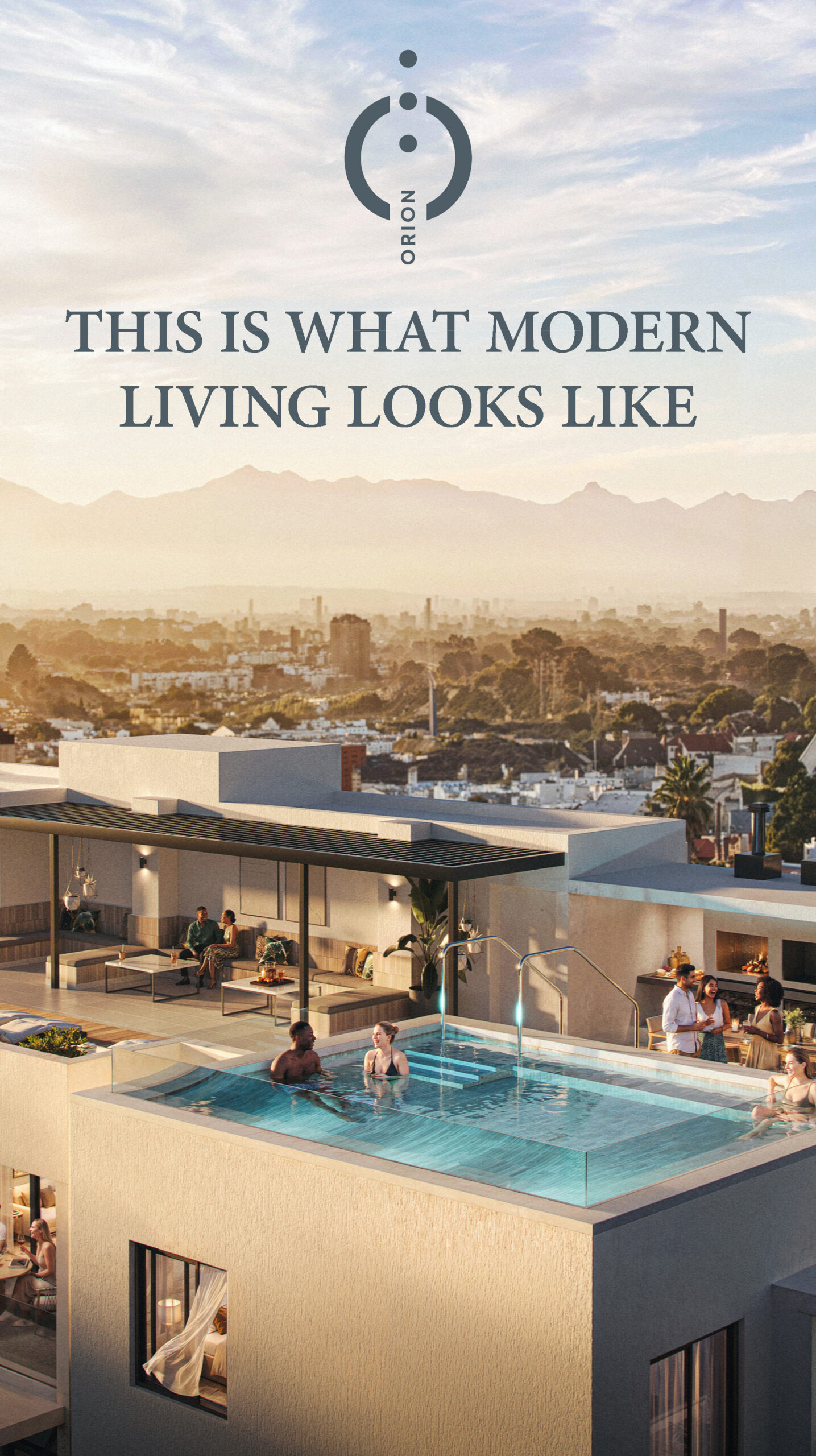
Spring has sprung, summer is around the corner and the easing of lockdown restrictions to Level 1 means everyone is out and about looking for ways to spruce up their homes. Moreover, would-be buyers on the hunt for a new home or investment benefit from the record-low interest rate and are spoilt for choice in the current buyer’s market. HomeFront looks at some of the best ways to update your walls and floors – do it right and you could be adding a breath of fresh air to your living environment and value to your property.
Colour of courage
Extensive trend research by AkzoNobel and other paint experts around the globe has revealed Brave Ground (code CF21) as the 2021 Dulux Colour Future Colour of the Year. Considering that 2020 has been characterised by constant upheaval owing to the Covid-19 pandemic, it makes sense that Brave Ground imparts strength and serenity. It can be combined with a range of complementary palettes and techniques to bring balance, stability and courage into our surroundings. “This warm, natural colour provides a strong foundation for embracing change,” says Dulux SA colour expert Palesa Ramaisa. “Brave Ground stands on its own as a beautiful, powerful neutral hue and can be used in a way that allows other colours to shine.” Dulux has put together four colour palettes, each of which takes the shade in a different direction: Expressive, Timeless, Earth and Trust, featuring complementary earth tones from around the world.

Tile stories
Tiles give a room personality, with the added benefit of being easy to clean and maintain. Neutral options abound, but consider expanding your horizons with textured tiles that beg to be touched. Inspired by the decorative inlays crafted by Italian artisans in the 13th and 14th centuries, the Intarsi range of ceramic tiles from Ceramica Sant’Agostino combines the contrasting looks of marble and wood. Also from Sant’Agostino, the slender porcelain Colorart tiles evoke worn, weathered timber planks. Both ranges are distributed by Italtile and can be used for walls and floors.
Simple yet striking
Hardwood flooring is a timeless addition to any home. Looking out onto the Kromme River estuary, this summer retreat in St Francis Bay took its design cues from Cape farm architecture and a fisherman’s cottage. The home’s natural palette is the ideal backdrop for colourful furniture and statement objects, whereas the warm wooden floors by Oggie Hardwood Flooring provide a sense of cohesion. Oggie stocks an extensive range of wide-plank oak flooring and wall cladding options sourced from sustainable forests.

Cool contrasts
A designer client of Jenny Mills Architecture and Interiors decided on a dark interior for one of his properties after reading books by Anouska Hempel, a hotelier and interior designer known for her dramatic work. To achieve the look, the walls were chipped back to expose raw brick and the ceiling was painted black, with parts given a rusty colour. In contrast, one wall was painted using a palette inspired by Ndebele art, accompanied by an eccentric take on an exposed electrical box. “The home is set in a conservative Constantia enclave, so it’s an amusing and refreshing break to open the doors to this warm, dark interior,” says founder Jenny Mills.
No wallflowers here
“Wallpaper allows the discerning homeowner to create drama without the use of expensive art or framed prints,” says Cara Saven of Cara Saven Wall Design. “It can be used to dominate a space or give it depth, and always lends value to a home.” The owner of this Franschhoek home wanted to add a touch of warmth using wallpaper, and a dramatic focal point for guests entering the house. An oversized blue heron now lives in the lounge, with its surrounding landscape extending into the dining and drinks area. “It brought the whole open-plan space together in the most sophisticated way,” Saven says. “The bedroom is an oasis in this glamorous home and the owner’s husband had no problem with the use of oversized pink floral design over their bed,” says Cara. The pink and grey colour scheme is pulled together by the wallpaper. “The concrete background in the wallpaper contrasts beautifully with the softness of the flowers and creates an effect they won’t tire of in a hurry.”

“Wallpaper allows the discerning homeowner to create drama without the use of expensive art or framed prints” Cara Saven, Cara Saven Wall Design