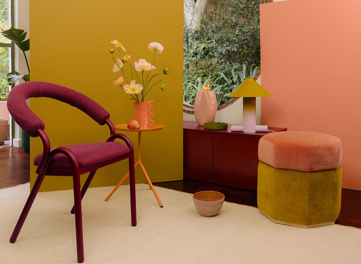
Lush, generous and full of life, Orchard + Blooms is a colour world inspired by the sensory richness of fruit markets, garden centres and flourishing outdoor spaces. It celebrates abundance in all its forms like ripened produce, layered foliage and sun-warmed petals. It’s the palette that brings vitality indoors through expressive, organic colour.
WORDS & PHOTOS: SUPPLIED
One of four colour worlds within the Plascon Colour Forecast 2026, Orchard + Blooms sits alongside Butter + Sky, Land + Sea, and Fashion + Candy. Together, the worlds form part of the overarching theme ‘HAND, made’, which foregrounds the human touch, natural cycles and the textures of daily life as key design influences for the year.
Orchard + Blooms is the most overtly organic of the four worlds. It draws from the colours we associate with nourishment and growth: peach and orange blossoms, olive-green leaves, deep terracottas and the rich tones of fruit at peak ripeness. The result is a palette that feels grounded yet joyful.
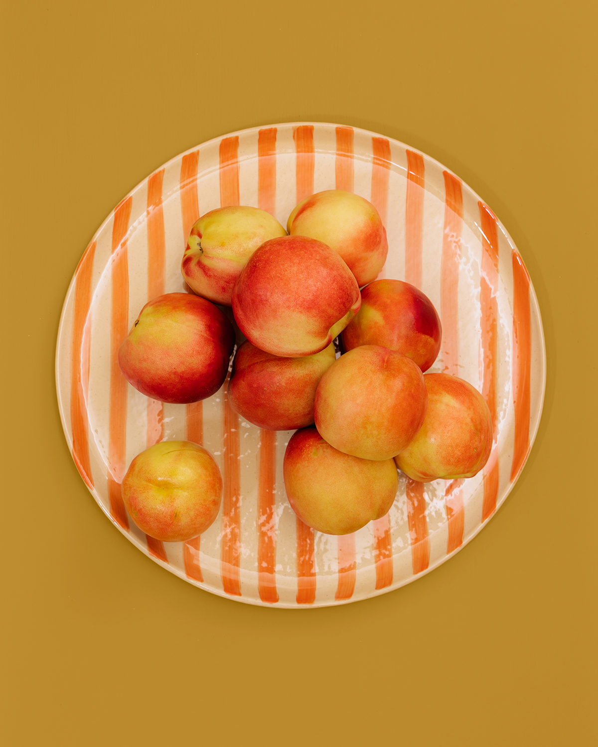
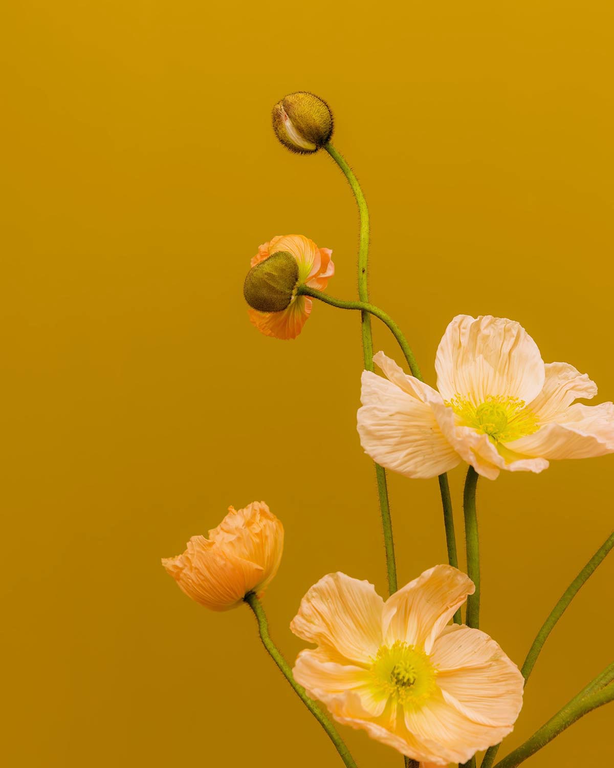
This speaks to a broader shift in how we want our homes to feel in 2026. As life becomes increasingly fast-paced and digitally mediated, there is a growing desire to reconnect with the rhythms of nature and the comfort of familiar, sensory experiences. Orchard + Blooms responds to this by offering colours that feel instinctive and nourishing.
The curated colours within the Orchard + Blooms world include Chocolate Delight (R6-E1-1), Hudson (26), Spanish Brocade (O2-B1-3), Swazi (R2-C1-1), Wanda (Y4-C1-1), Good Day Sunshine (O6-A1-1) and Just Terracotta (R7-C1-1). Together, they create a layered story of warmth, richness and renewal.
These colours encourage a sense of generosity and ease, echoing the feeling of gathering, sharing and living well. Used tonally, they create grounded, enveloping environments. Paired with lighter accents, they bring a fresh, uplifting quality that feels distinctly contemporary. Orchard + Blooms lends itself to interiors where energy and connection are key, such as kitchens, dining rooms, living areas and creative spaces.
The colours are expressive without being overwhelming, earthy without feeling rustic, and vibrant without tipping into excess. They encourage layering, whether colour with colour or texture with texture, and invite homeowners to trust their intuition when building a palette that feels personal.
Like all four colour worlds in the Plascon Colour Forecast 2026, the shades in Orchard + Blooms are drawn from Plascon’s existing colour library and can be tinted in your choice of Plascon coating at leading retailers nationwide.